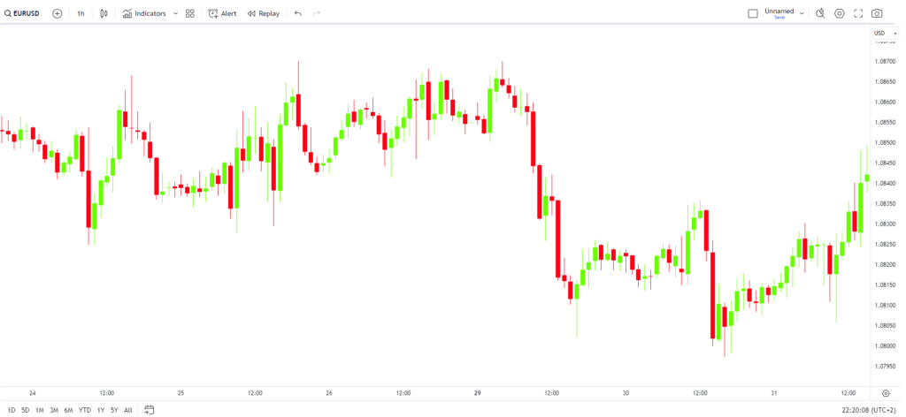
Before we dive deeper into the intricacies of trading, it’s essential to familiarize yourself with the layout and components of a typical trading screen. Whether you’re trading on a desktop or a mobile device, the fundamental information presented remains consistent across platforms. Understanding these basics is crucial for making informed trading decisions and effectively analyzing market movements.
In this section, we’ll break down the essential elements of a trading screen using a candlestick chart, the most widely used type of chart in trading. The information displayed here is also applicable to bar charts, though candlesticks offer a more visual and intuitive representation of market data.

Figure: A typical Forex chart on a trading screen.
Understanding the Candlestick Chart
The red and green candles you see on the chart represent the price movement of a currency pair over a specific time period. The color of each candle indicates whether the price moved up or down during that period.
- Green candles (often called bullish candles) indicate that the closing price was higher than the opening price, signifying a rise in price.
- Red candles (often called bearish candles) indicate that the closing price was lower than the opening price, signifying a drop in price.
The time frame of the chart dictates the duration each candle represents. For example:
- On a daily chart, each candle represents one day of price action.
- On an hourly chart, each candle represents one hour.
- On a 15-minute chart, each candle represents 15 minutes, and so forth.
Key Elements to Focus On
Now, let’s focus on some crucial components of the trading screen:
- Price Axis (Right-Hand Side Panel):
The numbers displayed along the right-hand side of the chart represent the price levels of the currency pair you’re trading. These price levels are vital for analyzing market movements and making trading decisions. As you observe price action, you’ll notice how these levels correspond to the highs, lows, opens, and closes of each candlestick. - Time Axis (Bottom Panel):
The horizontal axis at the bottom of the chart represents time. Each interval corresponds to the time frame you’ve selected for your chart, whether it’s minutes, hours, days, or weeks. This axis helps you understand the temporal context of price movements. - Currency Pair (Top-left):
The currency pair that you are trading is shown at the top-left of the screen. You can change it to whatever currency pair or index you want to trade. - Indicators
On the panel that shows the currency pair, you can access different indicators. More on the indicators later.
Breaking Down the Candlesticks
Let’s take a closer look at the anatomy of individual candlesticks, which are the building blocks of your chart analysis. Understanding these components is essential for interpreting market sentiment.
Example 1: Bullish Candle
Figure: A bullish candle’s opening, highest, lowest, and closing prices.
- Opening Price: 1.3274
- Highest Price: 1.3386
- Lowest Price: 1.3245
- Closing Price: 1.3361
This candle is considered bullish because the closing price (1.3361) is higher than the opening price (1.3274). This indicates that buyers were in control during this period, pushing the price higher.
Example 2: Bearish Candle
Figure: A bearish candle’s opening, highest, lowest, and closing prices.
- Opening Price: 1.3358
- Highest Price: 1.3377
- Lowest Price: 1.3193
- Closing Price: 1.3232
This candle is considered bearish because the closing price (1.3232) is lower than the opening price (1.3358). This suggests that sellers dominated the market during this period, driving the price down.
The Importance of Familiarization
Before advancing to more complex trading concepts, it’s crucial to familiarize yourself with these basic features of your trading platform. Mastery of these fundamentals will enhance your ability to read charts, identify trends, and make strategic trading decisions.
As you progress, you’ll find that these seemingly simple components form the foundation of more sophisticated trading strategies. Whether you’re analyzing long-term trends or making quick decisions in a volatile market, your success as a trader hinges on your ability to interpret the data presented on your trading screen.
In summary, understanding the structure and components of a basic trading screen is the first step towards becoming a proficient trader. By familiarizing yourself with how price movements are displayed, you’ll be better equipped to navigate the markets and capitalize on opportunities. This knowledge will serve as the cornerstone for more advanced strategies and techniques as you continue your trading journey.
